Archive | Advanced Digital manipulation RSS feed for this section

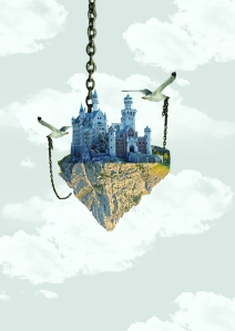
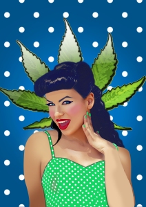
Final two images !

3 May

I really enjoyed this assignment, I would say more than the first assignment as there were no limits ( last assignment we have to use images provided) I started the project by researching in to images I liked and in my mind tried to work out how the piece was done. I tried many tutorials I found and experimented with different techniques.

I chose to do a vexel piece as before this assignment I had never tried that before so I wanted to challenge myself to do something new. Surprisingly I really enjoyed it and found it was rather fun, I thought I would struggle with it as it was new to me but once I worked out the basics I enjoyed it more and more. I did not really come along any problems whilst doing this piece so the process was straight forward.

Originally I wanted to create a mixed media piece for one of my final pieces along with a horror poster or scene as it not something I would normally do but whilst researching I came across a design that I really liked and I was eager to try and recreate it in my own style. I worked out how the piece must have been created and then started looking for stock images I would need from DeviantArt. Along the way I noticed I had made changed so I was not directly copying the design I was inspired by. By the time I had finished this piece the original design and my work looked very different which is what I was aiming for.

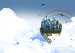
A problem I came across on the fantasy piece was finding the right stock, I made my own clouds, background and rainbow but I struggles to find a good sized mountain. Bearing in mind I was working on A3 I did not want to stretch out the image so I made the castle and mountain smaller than intended. The castle itself was a good stock image and was very clear, I used the pen tool to cut around it so it was very sharp and neat cut. Luckily I found some png tree stock images so I did not need to cut around the trees, I think if I would have had to cut around the trees it would have taken me a very loooooong time.

If I was to start this project again I would perhaps try to challenge myself more by creating a horror piece as I originally intended rather than the fantasy piece, but having said that I feel as though I learnt many skills from this piece. I would say I have now become more used to creating my own backgrounds rather than using premade stock backgrounds as in the future I will not be relying on stock but will have to create my own.

Over all I am very happy with the outcome of my work and I believe I have learnt skills that I will be using in other assignments and in the near future.

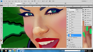
Close Detail

2 May

Having done lots of research on vexel style painting i feel like i have learnt so much from them, unlike my other final piece i did not use any tutorials for this piece, i just went along learning from any mistakes i made. I think the reason to why i enjoyed making this piece is because i am interested in this style of work, i love the pin up girl look and the bold eye catching colors. The image above is a close up of detail, i tried to add single hair strands to the image to make it stand out and look better adding white to make the hair look shinny. I also made a few changes to the original image such as changing the eye color, painting her nails and adding eye make up as well as more pink on her cheeks.

Stock for image 1

2 May

Hello boys

By: AnnaMariaDeMari

http://nikoleta11.deviantart.com/favourites/49480133?offset=24#/d4xmt9y

PNG nice flower

By : ms-an9el

http://ms-an9el.deviantart.com/art/PNG-nice-Flower-132443754

Stock for image 2

2 May

Image 1: Pine trees png stock

By: mysticmorning

http://nikoleta11.deviantart.com/favourites/49480133?offset=48#/d33bz9x

Image 2: Soil

By: iria2k

http://nikoleta11.deviantart.com/favourites/49480133?offset=48#/d1f1ufi

Image 3: Castle stock

By: skinywitch

http://nikoleta11.deviantart.com/favourites/49480133?offset=72#/d1ve5ol

Image 4: Mountain

By: Goddamner

http://browse.deviantart.com/?q=mountain&order=9&offset=24#/d2sz871

Applying Rule Of Thirds

1 May

I think the reason to why the 2nd piece works better than the 1st image is due to the rule of thirds, The theory is that if you place points of interest in the intersections or along the lines that your photo becomes more balanced and will enable a viewer of the image to interact with it more naturally. Without explaining the rule of thirds theory i asked several people which design they proffered and the majority like the 2nd image better. Personally i also like the 2nd image better although there are still a few things i need to improve on it . Whilst asking for peoples opinions a friend advised me to perhaps add a cloud in front of the mountain or the castle as it looks too flat, i had not picked up on this before but looking back on it i see she has a good point so my next step is to re arrange the clouds. I wanted to include chains as you can see under the castle but i am now having second thought about it as im not sure it looks right. This only means one thing.  . .  more experiments :/


Im not really sure if the rule of thirds applies in this piece but i think it does, i placed the girl on the side to leave plenty of clear space on the side (in this case polka dot space on the side) i did not want the girl in the middle as it did not look right. Also the text that said ‘ well… hello boys’  i though that did not fit in all though it gave off a flirty feel which is what i was aiming to do.

Step by step

1 May

Having done this experimental piece i can now see what i like and dislike about it, i personally like the dark background as it looks more mysterious but i think the clouds do not look right against a black background.  I am also not so sure about the text, i wanted to give it a hand writing style to make it personal but looking at it now i do not think that looks good :/

I changed the background as an experiment and i do think it looks slightly better, the clouds defiantly  blend in more. I wanted to make it landscape as my 1st piece is portrait so i wanted it to look  different.

My next step from here is to arrange the clouds better and to add more color and excitement to it. I was considering adding a waterfall in it but I’m not sure i want to as whilst researching iv seen it done before, i want to create a unique piece so i will try my best to make it look different. Rather than a waterfall i could include a rainbow or birds flying around which will give in a more magical feel to it. When starting this piece i though the most difficult thing to do would be the clouds but i got past that thanks to a YouTube tutorial i found so i am very relieved i got past that stage.

In this next image i added the rainbow, once again i thought i would struggle with this but rather than get a stock image and cut around it etc, i decided to make my own. I simply used the pen tool to start of with then right clicked and went on stroke bath etc. once that was done i turned down the opacity to 25% as i wanted it to blend in and not take the attraction away from everything else, also rainbows are not that strong , they are slightly see through so i then went on to adding a gaussian blur of 10. This made the rainbow look more realistic and i made it myself without using stock images so that’s even better 🙂

Having experimented making this piece portrait and landscape i have changed my mind again and made it portrait, this might change again as the experiments go on as i keep changing my mind, i think i will have to continue with the experiments and at the end see which one looks better. . .

I am now adding in the clouds, i have made several cloud brushes as i don not want to be using the same one again and again. So Far i am happy with the way this piece is going so i just have to keep this up and i will be fine. In this piece i would say i am most happy with the castle as i managed to find a good clear image and i cur around it using the pen tool which was very easy and it gave the castle a clean look also the clouds, i thought i would struggle to make and orange them but it seems like im getting there slowly.

I experimented adding crows just to see what it looked like, i personally like it as it gives the viewer more to look at and i find it completes the image but the piece itself was meant to look heavenly and people associate crows to be evil/ scary so im not sure using crews is a good idea. .  I cropped this image to get a closer look at the main detail and i am once again having second thought about the whole landscape portrait thing :/

Filling in the gaps with clouds and once again changing it to landscape :/

I think the more i work on this image the more i like it as i keep adding new things to it and i get more and more ideas as i go along where as my other piece (vexel pin up girl) i got the idea and i was happy with it to start of with but the more i looked at it the more i started to notice the small things i didnt like about it as i had looked at it for too long, this piece is the other way round.

New idea !

I was randomly looking back on experiments i did before  (on my blog) and i came up with a new idea , I mixed the two images together,the image of the castle floating in the fair and the castle in the hands: I put the castle on one side as i wanted to try stick to the rule of 3rds.

I think i now prefer this latest idea so i will probably continue working on this 🙂

Random experiments

30 Apr

This image is a fast example i tried when i was experimenting randomly trying to get some ideas, it didn’t take me long to make at all (that’s why it does not look that great) .  As an idea i think its good, im not sure i will continue with it but if i do i know where to start and what would need improving etc as i did this mini experiment. I used the chains from a previous project i did so i did not have to cut around them as this is just an experiment to see roughly what it would look like..

p.s i didn’t even cut around the mountain properly as it was just an experiment :/

This is another experiment i started, i wanted to try create a scary dark piece as its something i would not normally do, I used different layers to create the background and i drew in the wall markings to make it look like a scary scene from a horror movie. Im not sure if i will continue this piece but if i do i would include an image or a trapped person in the cage to make it look more horror. I think it would  be interesting if i continue this as this is not my usual style but i will have to see how it goes 🙂

decisions decisions . .

29 Apr

This slideshow requires JavaScript.

looking at these alternative images in the slide show makes me see clearly which ones work and which ones don’t. I think my personal favorites are the ones with the green background as it looks bold and i personally think it looks good with the green top but will see how it goes 🙂

At the moment im torn between the two images below:

Trapped / cage

29 Apr

This slideshow requires JavaScript.

Whilst researching random images for influences  i came across these images that i really likes. After looking at these images i was considering doing a similar piece but after i tried experimenting with it i did not really enjoy it so i went another direction. there is an example of my experiment on the next post .

2nd design printscreens

29 Apr

Original image :

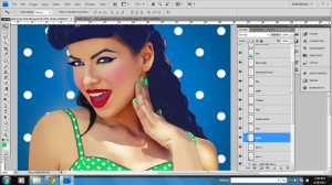
I started of my roughly cutting around the image i had chosen, i did not want to spend too much time in using the pen tool and taking my time with this image as i was not 100% sure this was going to be the final image i wanted, i really like this image but i was still searching so i might find an image better suited..The screen shot below shows where i have changed the eyes and eye brows, i wanted to make her look more exotic so i changed the eye color. I used a polka dot background to see what it would look like again other patterns in the background.

I then came to the rescission this image was perfect for the style i was trying to get, i used the pen tool to cut around the image properly, screen show shown below:

I continued working on the eyes, in the original image the eye lashes did not stand out so i worked on that, making it look like she has make up on trying to give it a 50’s look.

I wanted to cover the tattoos on the arms so i selected the color sample took (i) and went over the tattoo:

Tattoo covered, lips,eyes, nails, skin done. along with top changed color.

Close up: i wanted to experiment more with the background to try something new rather than going along with the typical polka dots although i do personally like it.

Here is an almost complete image :

I am happy with the way in which this piece has come along but i am not sure if i should have this background of the blue polka dot background.  decisions decisions.

other alternatives: