Evaluation
14 MayBrief:
Having looked over the brief I thought working in a group, would be a good opportunity as we could create an end of year project together, which would be a great ending to our time together as students.
Research:
Having come to the conclusion to which quotes I wanted to illustrate, I thought it would be a good idea to see what has already been done, so I researched on Pinterest to find some exciting work. I believe research made me very determined and inspired me to do well and work hard in this project, having seen what other designers have illustrated made me what to do the same!
Job roles:
In one of our group meeting we decided to split roles to make sure everyone had an equal part to do, this I believe was successful as everyone went away and got on with what they had to do yet at the same time we all felt (I felt) we could easily contact each other for opinions, feedback and help.
Along with Chloe and Chris, my role was branding. The three of us used facebook as an easy way of communicating. We illustrated many book cover designs and sent them to one another getting feedback and mixing ideas together before presenting them to the rest of the team. We had lots of positive and critical feedback in which we then went back and made more changes in order to finalise the cover design. Although the three of us had this role, James Sparks designed a cover as an example that everyone was keen on, we then all agreed that would be the front cover as it was the most simplistic and sleek design.
Contact:
Having narrowed down everyone’s job roles, we had to find a suitable solution for everyone to stay in contact, especially over Easter, we have set up Contemporary Graphic Design group on Facebook so only group members are part of it and we are the only people who can see what each other posts. We have found this to be very useful so far as we all get notifications/emails when someone posts something on the group page.
As well as this, Chloe has kindly set up an email address for us all to share. This will be a good way of receiving content from other students and we will all be able to access which is very important! Using the same email address, a Dropbox account has also been set up for everyone to upload their designs and quotes as well as contributor’s designs and quotes. We have also signed up on Pintrest where we can pin images to our group board. This is helpful and inspirational as we can post images to give us ideas about our book. We can post anything from colour scheme ideas to fonts and layout examples
Weakness:
The only weakness i noticed in this project was that some team members did not attend most meetings and therefore had to be contacted and updated on changed. I believe obstacles like this will always happen when working in a group it’s just a matter of working round it. Also i couldn’t help but notice some peoples work was not at a high standard as the rest, my solution to this is help and advice them on how to improve their illustration/s.
My final illustrations:
Over all I am very pleased with my final illustrations and I am very glad all of them went in the book. If I could do this project again I would spend longer on a quote that I had in mind but did not follow through, having said that if I had followed that through my final illustrations may have suffered the consequences as time was limited and I wanted to perhaps take on more than I can handle.
Over all final product/ book:
I am very happy with the final book, I think it looks amazing and I am very glad I chose to be in the group project. This is a great piece to keep for future interviews and a good memory of my time at university.
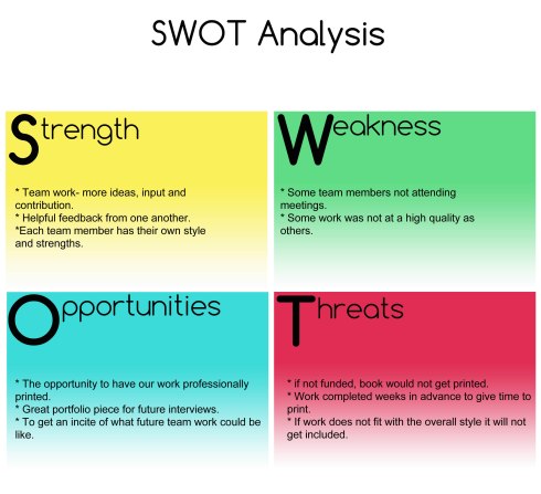
SWOT Analysis
14 MaySwat Analysis stands for Strengths, Weaknesses, Opportunities and Threats:
Strengths:
- Team work- more ideas, input and contribution
- Helpful feedback from one another
- Each team member has their own style and strengths
Weakness:
- Some team members not attending meetings
- Some work was not at a high quality as others
Opportunities:
- The opportunity to have our work professionally printed
- Great portfolio piece for future interviews
- To get an incite of what future team work could be like.
Threats:
- If not funded, book would not get printed
- Work completed weeks in advance to give time to print
- If work does not fit with the overall style it will not get included
Evaluation
3 MayYCN – Very Brief Evaluation
Having teamed up with my class mate Charlotte wood we both came to an agreement to pick the Very brief. This was best suited to us as the brief involved fashion and so we would enjoy the process yet it was challenging as the brief required something new.
Myself and Charlotte started this project by reading the brief carefully and highlighting key words such as the Very personality, their mission and the creative challenge, from there we started researching existing markets and platforms such as advertisements, catalogues, phone apps, Facebook and Twitter pages and much more. Our challenge was to create something new so we then started making brain storms gathering as much ideas as possible. Having done this we then referred back to the brief eliminating any ideas that did not relate to the brief.
Myself and Charlotte both made a timeline that would be suitable for both of us in order to stay on track and not fall behind. We made sure work was always done at least one day in advance just in case we came across any difficulties.
We arranged regular meetings every Thursday which was convenient for both of us and having Design Practice lectures the next day so we could go over our ideas with our lecturer Kate.
Having narrowed down ideas, myself and Charlotte both agreed that the best solution for this brief was the personalised fashion diary as this is something Very have not done before so it’s a new category for them and also this is a great way to display fashion throughout the year as Very specified in the brief. Having come to this conclusion we both went away and designed mock up page layouts, designs and colour schemes ready for our next meeting in which, we narrowed down the style for our personalised fashion diary. Once this stage was complete we split roles by making lists of what we should each do before our next Thursday meeting. This was a great way to avoid us both making the same design layouts and to ensure we are both working equally as hard as each other. We constantly emailed work to each other to make sure our designs were relatively similar regarding colour, typeface, font sizes and border sizes.
Although the brief states we must not exceed fix colours for print (unless we have a valid reason) we decided that Very is a colourful brand and having looked at their brand bible we both agreed that it was important to get the Very personality across in our diary, we did this by using lots of colour, same typeface and we used a playful/ fun tone of voice as specified in the brief.
Having completed our designs we had a group meeting bringing everything together, although we were both satisfied with our work we wanted to make sure our target audience (women aged 25-44) would also relate and love our designs and ideas. We made a short questionnaire asking specific questions about our layouts, colour choice and diary size. We printed these out as well as emailed them to the relevant target audience. In order to be fair with our feedback we went to Westwood cross and asked women who seem to fit our target audience for feedback and advice in how we could improve our diary. Having planned our time efficiently we made sure we would have a few days to make alterations if required based on consumer feedback.
Over all I am very happy with our final product as I believe it fulfilled the brief requirements in producing something new and exciting for the Very customers. I feel that myself and Charlotte make a great team as we planned ahead and were always organised, having regular meetings and emailing work to each other to get feedback. We have both been very open minded throughout this project and so I feel a mixture of our ideas has made this project very successfu
Process and final work
3 MayOur team consists of two members Charlotte Wood and Nikoleta Gjergji. We have been working together from concept through to completion of the project arranging regular meetings and splitting tasks.
Brief:
The creative challenge is to devise a campaign or concept that decodes key style events throughout the year being perfect, relevant advice and style tips.
Solution:
In order to fulfill this creative brief we decided to design a personalized fashion diary being unique to each customer. We believe this is a suitable solution in order to decode fashion styles throughout the year.
The target audience being women aged 25-44, we have based the diary around each personal consumer. Very provide products for men, children and house hold items therefore we wanted to include a variety of products throughout our designs having each layout based around a calendar month, colour and events which each customer has included upon the online Very questionnaire.
As the creative challenge asked ‘to inform and surprise our lovely customers with something amazing once a month’ this is where our inspiration for the Very fashion diary came from.
We took into consideration the importance of displaying a range of products such as home ware, men’s fashion, children’s clothes, perfumes and accessories as well as women’s fashion.
Research:
As included within the Very brand bible when informing the customer on style guidance we have kept in mind the tone of voice and the personality of Very by keeping in fashion savvy, playful and sassy, as defined within the brief.
To gain wider research we looked at Very’s website as well as their Facebook page, Twitter, Mobile Phone app, YouTube videos and television advertisements.
Plan:
Each month layout will be displayed as a double page spread at the start of each new calendar month. These spreads will be based around our colour chart and particular events based around that month, due to information given within the questionnaire. Each diary will essentially be unique to each customer, due to the information supplied from the questionnaire.
Questionnaire:
The online Very questionnaire is used for each customer to apply for a personalised diary by including their own, family and friends personal details if wanted. These details can include information such as Birthdays, calendar celebrations, anniversaries and other if necessary. In the questionnaire we have considered the data protection act, there for only name and address is applicable for the customer. This questionnaire also gives the customer the option of including body shape, hair colour, celebrity inspiration as well as favorite brand.
This questionnaire is available at: http://bit.ly/ZAlq5R
Colour:
Although we have exceeded six colours for print, we feel that this is justified through aspects of the design within the brand bible, it is clear that Very are a colourful brand therefore having portrayed a variety of colours throughout our designs. These colours are shown through the borders within the layouts as to not overwhelm the page with colour whilst showing Very’s border preference.
For the cover of the diary we have decided to use the ‘Very pink’ combined with the white Very logo with tagline and URL. We feel this makes the product stand out for customer recognition.
Experimental designs:
We decided to create an A6 personalised fashion diary, unique for each Very customer. In order to decode the ‘Very reveals the style that works for you’ we have designed each calendar month within the diary based on each customers lifestyle and personal details such as birthdays and celebrations e.g. Christmas, Valentine’s Day, Easter. Each month will have its own colour based on our colour chart (rainbow colour chart).
Final product:
Having experimented with different page layouts, we have come to the conclusion that splitting a page spread into four days will give customers plenty of space for notes, with the alteration of a three-day layout dedicating a full-page for notes on a special event day, such as a birthday.
As included within the questionnaire, we have made each diary personal to each customer by giving them style guidance based on their body shape and hair colour. This may help the target audience by giving them that little bit of guidance when needed, due to busy lifestyles.
To help consumers with inspiration and style guidance, we have included the option of three celebrity layouts as well as body shape and hair colour.
Based on the consumer’s questionnaire entry, there is an option of having a gift suggestions page for him, alongside with the option of choosing your favorite brand.
In order to link the calendar months with events throughout the year we have displayed a range of products that the consumer might want to purchase for example for Valentine’s day.
The diary can include birthday reminders if the consumer choses to in the questionnaire.
All artwork included within our designs were taken from very.co.uk and the project pack supplied.
In conclusion, our idea of the personalised fashion diary could in future expand as an app or online social diary which could include forms of social networking. Overall, we feel that the Very diary reveals the style that works for each unique customer.
Third quote
4 AprMy third quote is ‘I love the idea that an image is universally applicable but hate that the message can be interpreted differently by audiences’ but i am thinking of changing this as having thought about it, i do NOT hate that the message can be interpreted differently by audiences, In fact i find it rather intriguing.
So with this in mind i have come to the decision that the quote will be shortened to:
‘A universal language to be interpreted by many different audiences’
Wanting to create a piece that everyone can understand yet interpret in their own way i came up with the idea of a heart with a design in the center and see what everyone thinks about it.

So far the feedback iv had for this one is:
- I see a red heart in which I see two people kissing
- A heart- the left side has a face and the other side is just a cracked piece.
I thought this first draft was a little easy so i made a few changes to it:
 The Feedback i got for this piece:
- A broken heart, with a subtle outline of faces.
- A girl going for a kiss,… it looks almost like she is holding a baby,… trying to kiss the baby…
- A face in red and face in white
- I see a broken heart and four faces
- A broken heart and two people facing different directions, the heart breaking represents the end of a relationship and so the faces/ people are going in their own separate ways/ parting.
- two faces one kissing another
- It looks to me like a heart thats torn between two loves, not one thats broken.
- A broken heart with two faces in the center, one kissing the other’s forehead and the other kissing the neck
- I see a broken heart and two faces, a man on the top left and a woman under him on the right side. it’s like if they’re looking at each other but they’re on different sides of the heart, like two different and separate sides of the same love though, it’s quite a sad image i think.
- two ppl facing one another ,on neck aswell and two paralelle faces
- I see unity because the two pieces overlap info each other, passion because it’s a two people and its red and love because it’s a heart. If I had to turn this into a story I would title it ‘two become one: a tale of true love’
So far i am happy with the feedback i got, overall most people noticed a heart with two faces but some of the feedback had a story behind it which is very interesting. Having thought through everyone’s feedback i think this pieces does what i intended which is for everyone to look at the same image but interpret it in their own way 🙂
I find it very interesting that everyone can be looking at the same image but whilst one person sees a love story of two people kissing another person looks at the same image and sees a couple breaking up and parting whilst another person sees a woman kissing a baby! I love the feedback ! 🙂
Because i really liked the map incorporated in the clouds i thought it would be good to try the that cloud effect with the heart and faces to see how that looks (still needs some work done to it) :
Third quote world/map
3 AprI love the idea that an image is universally applicable but hate that the message can be interpreted differently by audiences.
Although i like this, i find that it looks like a map and not enough like clouds.
I like this one is a little better than my first draft but i still think the world is too obvious.
I like the idea behind these but at the moment i am struggling to create the piece i have in mind.
Having shown some people this piece and asked what they see this is the feedback i got:
- Clouds
- Clouds in the shape of the world map
- Clouds in the shape of a running dog facing left


